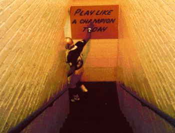
I had the privilege recently - through my job at Kiwanis
International - to travel to Fort Knox, Kentucky and visit the U.S. Army
installation there. Fort Knox houses all of the Army’s human resource and
recruiting operations. They also have a very strong education division,
which is who we met with. Anyhow, I had been there before, but this time
I took notice of the stairs that led to their main offices:
The U.S. Army is very big on values. They are printed everywhere, and everyone at Fort Knox knows them. The primary values, as seen above, along with the Warrior Ethos, are what all soldiers take to heart.
More on the army in another post. The purpose of this one is to illustrate the power of visuals. Like the Army, we are values-based organizations. How visually evident is that fact?
More on the army in another post. The purpose of this one is to illustrate the power of visuals. Like the Army, we are values-based organizations. How visually evident is that fact?
For those of you with chapter facilities, how are the values represented on signs, banners or the walls? If I’m walking up the steps of your chapter house, can I see what I’m walking into?
And no, a white sheet hung outside your chapter house that says “rush XYZ, text #5555” is not what I’m referring to.
At your chapter meetings, are there visual reminders of your values? For those who use written agendas, are they stated on the paper? The most effective nonprofit boards I know do this, or they hang up a sign at every meeting that states the organization’s mission. It’s


If you have a house, you can sprinkle references to your values all throughout. It’s easy decoration, and creates a message that’s hard to escape. Here’s an idea for a random morning: take a dry-erase marker and write on the bathroom mirrors, “how will you have integrity today?”

If you have a dining room, make table tents that share quotes/stories about your values. At move-in day, when parents are likely to be at your house, make a huge banner that says something like: “this home is built on scholarship, service, brotherhood, and leadership.” Get creative.
And of course, we have to discuss T-shirts. What do yours say? How does it remind the person wearing the shirt, as well as those who see it, of what you stand for? T-shirts make us walking billboards, and too many times, our billboards turn people off to the product we’re selling. Instead, they can be a tremendous opportunity.
Several years ago, at a UIFI session, I vividly remember a young man standing up in front of the group and reciting his fraternity's creed, which spoke about being a perfect gentleman. He did this while wearing a shirt that had a cartoon image of a man fleeing a half-naked woman lying in a bet, with the words: “XYZ Fraternity: We screw, we nut, we BOLT.”
The moral of the story, visuals can be a force for good or evil. Make yours a force for good.
Visuals matter because they remind our members of the values we strive for, they tell others the same thing, and they keep us honest about living up to them. If you paint your steps with the same kinds of powerful words that the Army does, then in essence, you are making no secret of what I should expect when I walk inside. Good. Now deliver.

No comments:
Post a Comment